work

Nothing speaks louder than a body of work. Resumes, references, lists of clients, degrees, diplomas, and certificates all suit specific purposes. But when it comes to designing a body of work, it trumps everything. Take a look - you will see not only quality but also variety, versatility, and artistry. Above all, trust your eyes: if it looks good, it is good.

If you want to cut to the chase and download the portfolio now, click here.

Logo // Identity Design

Photography by Brandon Sullivan

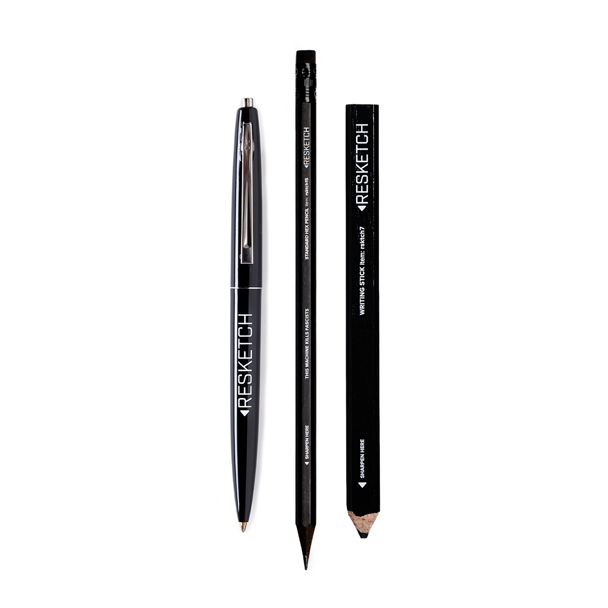
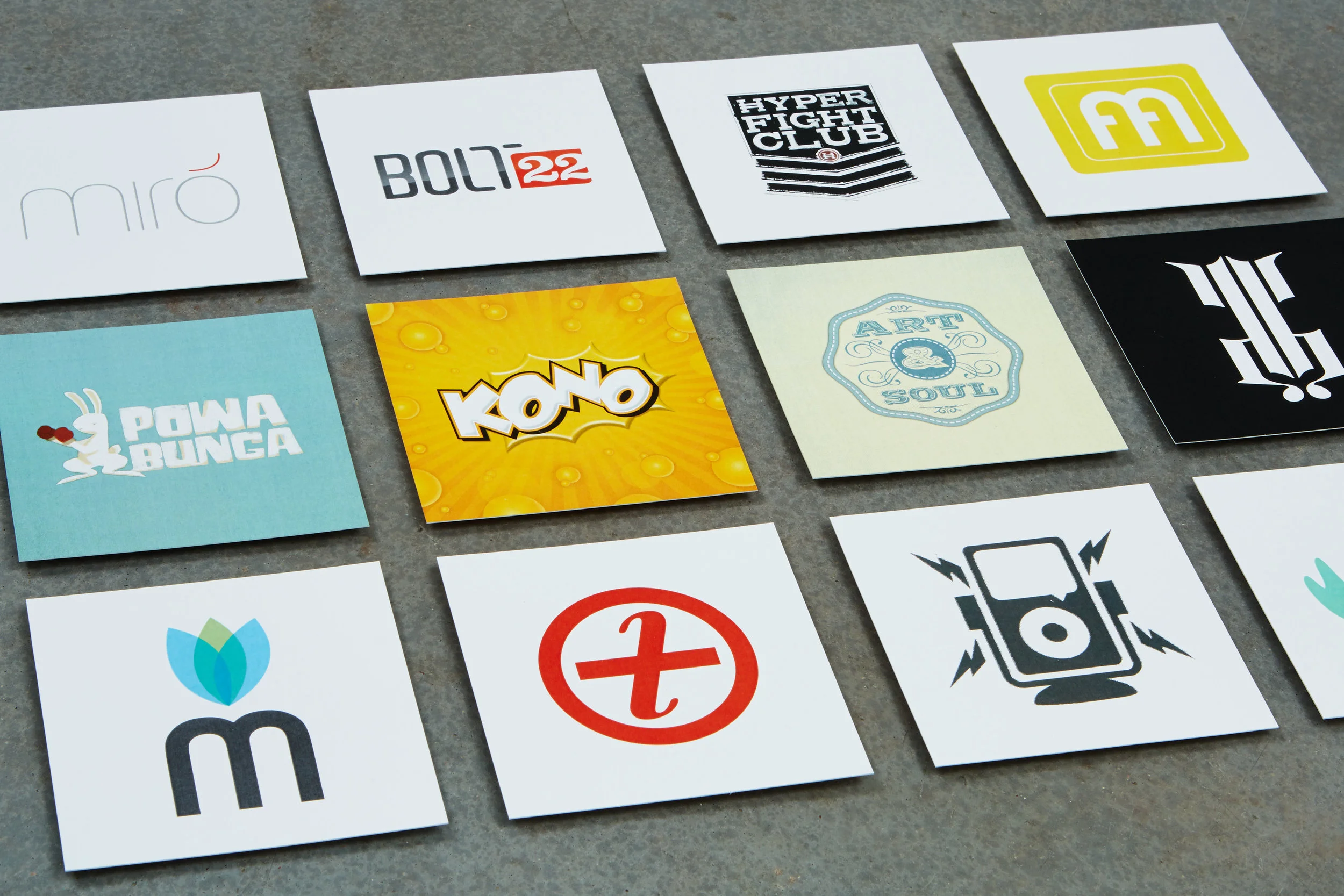
Logos matter. They are simple little symbols that can be devoured by the eye in milliseconds, yet they speak volumes. Their importance is derived from their birthplace - ancient Greece. The word logos is an all-encompassing word that contains concepts like narrative, explanation, and even reason. If a picture is worth a thousand words, a properly designed and researched logo can and should contain multitudes.

Cory is a consummate creative professional. His process is bulletproof and his identity and design solutions are impeccable. - Paul Howalt, Tactix Creative

No matter how the design problem manifests itself, storytelling is the foundation of effective design. This is especially true in the creation of logos and identity systems, where every detail contributes to a visual narrative. A logo is often the first interaction someone has with a brand, and it must convey a story that resonates instantly. The goal is to always design a logo that is monolithic and timeless in its solution, something so simple that nothing can be added or taken away without destroying that communication.


Want to see everything? Download and view the entire portfolio.


Resketch

Photograpy by Brandon Sullivan

The concept was simple. Build a brand around products built from rescued and reclaimed materials. Through relationships with the creative community, Resketch rescues 8-10 tons of unwanted and unused paper headed to the waste stream every year. Through pure creative alchemy, they make notebooks, journals, sketchbooks, and paper products from a wide variety of rescued and reclaimed paper and stock types.

Making an entire brand out of leftover spare parts is no easy task. What Cory has done with the redesign of Resketch is nothing short of spectacular. - Shawn Smith, Founder, Resketch

The goal was to create a high-end brand that didn’t overly emphasize the reclaimed nature of the products, instead focusing on merging creativity and sustainability seamlessly. The aim was to celebrate sustainability without apology, crafting a line of products that appeal to everyone - from the CEO of a Fortune 500 company to a crafty soccer mom - ensuring inclusivity without compromising on sophistication or quality.


Resketch is a sustainability-driven brand focused on creativity, notebooks, and paper products. The project included rebranding, new product design, editorial voice, a new website, and internal company systems. Resketch has been featured in publications such as Wired, Phoenix Magazine, Elevate AZ, The Obsessor, Core77, and Colossal. Products are sold online, in retail stores, and through custom and wholesale programs across the United States and internationally. 


Want to see everything? Download and view the entire portfolio.


Not Impossible Now

Photography by Brandon Sullivan

There are two kinds of people in the world: those who are optimistic about the future and those who are not so optimistic. Not Impossible Now is an organization dedicated to the former. This concept was filtered through the lens of technology. It was designed to capture the optimism about technology’s role in our lives and couple it with the organic. 

Doing a lot with a little is its own kind of superpower. Cory has a deep understanding of design and can manipulate the elements needed to fill a frame without overcrowding or overpowering the message. - Elliot V. Kotek, Editor-in-Chief, Not Impossible Now

The goal was to create a simple poster design that felt innovative yet human, reflecting the intersection of cutting-edge tech and meaningful human impact. The visual elements aim to seek balance with warmth and approachability. Yet, every detail, from typography to color palette, was chosen to evoke both sophistication and sincerity. Ultimately, the poster serves as a reminder that when used with purpose, technology can drive progress and connect us in deeply human ways.


Non-profit work is vital in creating positive change, and graphic design can be a powerful tool in creating that change. Not Impossible Now is one example where thoughtful design made a measurable impact. While non-profit projects can pose creative challenges due to limited resources, the results can be significant when approached with purpose and care. A simple request - to design a poster that would attract attention at a trade show booth - led to a 15% increase in foot traffic and helped raise awareness of the organization’s mission. This highlights how intentional creative work can contribute meaningfully to advancing meaningful conversations and causes, even on a small scale.


Want to see everything? Download and view the entire portfolio.


The Human Rights Report

Photography by Brandon Sullivan

Unfortunately, noble causes can’t get by on sheer nobleness alone. They need to be presented in an aesthetically pleasing manner while at the same time projecting competence and seriousness. With the Human Rights Report, the design needed to help shape the editorial model for a piece of print collateral that, visually, begs not to be ignored - on a topic that, ethically, shouldn’t be ignored.

The Human Rights Report was a very unique project with a lot of moving pieces. Cory quickly developed a strategy to tie them all together. From the attention given to the smallest of details to the creativity applied throughout, the quality of service and personalized care exceeded expectations. - Les Prendergast, Managing Editor

The goal was to create a serious publication on an important topic without feeling outdated or out of touch. By incorporating compelling visual metaphors supported by data, the publication was crafted to be both visually engaging and respectful of the subject’s gravity.


The Special Report on Human Rights was a custom publication developed with Human Rights First, BDP International, Inc., Thomson Reuters Foundation, Cordery, and Marriott International, Inc. The project included creative direction, design, print production, and editorial consulting. With editorial content by Stefan Linssen, editorial oversight by Les Prendergast, and illustrations provided by Tom Jellett. Published by Ethisphere, printed in California by RR Donnelley, and distributed to Fortune 500 companies. This publication was designed from the ground up to elevate the global dialogue on human rights, focusing on transparency, accountability, and shared responsibility, as well as encourage engagement on complex and high-stakes human rights issues.


Want to see everything? Download and view the entire portfolio.


Beyond Cinema Magazine

Photography by Brandon Sullivan

Most movies tend to be so slick and highly polished that we often forget the grunt work and constant revisions behind them. Beyond Cinema is an industry magazine dedicated to exploring the business of cinema in all its forms: scouting locations, the ins and outs of indie production, securing financing, etc.

Having previously collaborated on an award-winning publication, it was an easy decision to turn to Cory when launching Beyond Cinema. Cory’s attention to the nuances of design created the lasting brand recognition we were striving for, allowing our new brand to feel both fresh and effectively familiar. - Elliot V. Kotek, Editor-in-Chief, Beyond Cinema

The concept for Beyond Cinema was to let the movies speak for themselves. Give the images the space to shine, and, in the grand tradition of title cards, let the typography also have its own presence. It’s not always easy to embrace simplicity because simplicity in design takes courage. Still, Beyond Cinema proves that great photography and thoughtfully framed words can create something powerful and meaningful.


Beyond Cinema exemplifies what a small, passionate team can achieve when united by purpose; the project included creative direction, art direction, design, and print production. With content and editorial by Elliott Kotek, photography by Scott McDermott, and publication by Peter Trimarco for the Association of Film Commissioners International (AFCI). Printed by RR Donnelley in California and distributed at major film festivals - including Sundance, Cannes, and Tribeca - Beyond Cinema carved out its voice as the independent film magazine that not only celebrated the art of filmmaking but championed the stories, struggles, and vision of the creators behind it.


Want to see everything? Download and view the entire portfolio.


The Executive Briefing

Photogrsaphy by Brandon Sullivan

Thrills are not synonymous with corporate briefings. In this case, the concept was matching the forward-thinkingness of the CEOs and corporate thought leaders who contributed to this briefing with equally forward-thinking design.

The truth is, creating a small publication solely focused on CEO corporate culture was considered a risk. However, the end result proved the critics wrong. The concept and design Cory developed made the project far more successful than we ever could have imagined. - Stefan Linssen, Publisher

Like many corporate endeavors, the content and messaging often end up overthought, over-edited, and ultimately uninspiring. To break away from this cycle, you have to start from scratch and establish a few guiding principles. First, embrace a small, non-traditional format to stand out and be approachable. Second, eliminate the use of PR-approved photos, opting instead for art that felt raw and authentic. Finally, commission the portraits from artists who had never worked in the corporate space, ensuring a fresh and unconventional perspective.


The Executive Briefing was a custom publication created in collaboration with Corpedia and Ethisphere, designed to spotlight the evolving standards of ethical leadership in global business; the project included creative direction, art direction, design, and print production. With content and editorial by Stefan Linssen and illustrations by Tom Jellett, William Rieser, Allison Bruns, and Stanley Chow, each issue brought together thoughtful storytelling and visual clarity. Printed by RR Donnelley in California, the publication was polybagged with every issue of Ethisphere magazine, reaching an audience deeply invested in corporate integrity.


Want to see everything? Download and view the entire portfolio.


ReadyMade Magazine

Photography by Brandon Sullivan

The project was to guest art direct the Holiday issue of a magazine focusing on sustainable lifestyles and do-it-yourself projects geared toward the young and the tragically hip.

Readymade Magazine is an irreverent indie-rock version of Martha Stewart Living. - The New York Times

Stepping into an existing team and taking over as art director is a daunting challenge. The process comes with built-in clichés - preconceived notions about what the product should be, unfamiliar workflows, and the tension between wanting something fresh and the shock of the unexpected. Navigating these dynamics requires sensitivity to the team’s history and the confidence to push boundaries.

The concept was bold: let’s stop thinking of this as just a magazine and instead design it as an interactive workbook. DIY projects would be treated like recipes, with the goal that, by the end of the month, if readers completed every project, nothing would remain of the magazine but scraps and tatters. While we didn’t fully achieve that vision, we succeeded in evolving Readymade into a far more interactive and engaging experience.


ReadyMade was an independent, do-it-yourself magazine published by Walltext, Inc. The project included creative direction, art direction, and design. The magazine’s editorial leadership by Shoshana Berger, featuring contributions from across the creative landscape - including Todd Oldham - attracted a young, urban-minded, and environmentally conscious audience. ReadyMade offered an empowering, hands-on experience that blended creativity, sustainability, and style, setting a new standard for interactive editorial content.


Want to see everything? Download and view the entire portfolio.


Ethisphere Magazine

Photography by Brandon Sullivan

The goal of Ethisphere Magazine was not just to redesign a renowned business ethics magazine. New identity, new layouts, and new content were all needed. Still, something else was missing - it didn’t just need a make-over, it required a certain kind of reincarnation - same soul, different spiritual body.

What separates Cory from other designers is how he engages with his clients and his approach to process. Cory digs into his clients’ industries, learns about their markets and ultimately serves as a true partner in creating a product that both looks nice and, maybe more importantly, resonates well with the clients’ own audiences and customers. - Stefan Linssen, Publisher, Ethisphere Magazine

The concept was to approach the subject of ethics and compliance through a visual lens of fun and satirical commentary. While such topics can often feel dry and unengaging, reframing them in a creative and unexpected way transformed legal matters into something to experience rather than something to endure.


Ethisphere is a corporate B2B magazine published by Corpedia. The project included creative direction, design, illustration, editorial consulting, and project management, with editorial leadership by Stefan Linssen. It features contributions from Fortune 500 thought leaders and illustrations by RJ Matson, Mark Aspinall, Stanley Chow, and others. The publication was printed by RR Donnelley in California and distributed internationally to a global business audience. Positioned as a leading voice in corporate ethics and leadership, Ethisphere spotlighted the world’s most ethical companies while offering data-driven insights designed to help organizations strengthen corporate character, integrity, and transparency - key elements that shape public trust and drive long-term success. The magazine played a key role in shaping conversations around ethical leadership at the highest levels of business.


Want to see everything? Download and view the entire portfolio.


Kono Magazine

Photography by Brandon Sullivan

With Kono Magazine, the goal was to strike a balance between specialized learning and a broader exploration of true kids’ culture.

Cory was the first and only designer who really understood Kono's vision. He created a world for kids that was fresh, energetic, and cool without the kiddie cliches or cheesiness that we had seen with other attempts at brand identity. - HK Kim, Editor-in-Chief, Kono Magazine

The concept was to create the first fully immersive kids’ lifestyle magazine that seamlessly combined all aspects of a child’s life without losing the element of fun. Movies, video games, books, sports, health, and more — every topic that shapes a child’s world was included. Unlike most kids’ magazines, which tend to focus on a single aspect of childhood, this magazine aimed to treat kids as seriously as any publication would treat its readership. While children’s lives are often influenced by parents and other external factors, they still have active, curious minds and a desire to engage with a wide range of cultural touchpoints.


Kono was a kids-first consumer lifestyle magazine published by Kono Media; the project included creative direction, art direction, design, editorial, print production, sales, and subscription management. The Editor-in-Chief was HK Kim. Illustrations by Paul Howalt, Jonny Arvizu, Stevel Tansley, and more. The magazine was printed by RR Donnelley in California and distributed internationally to martial arts schools and newsstands across the United States. Supported by every major movie and television studio, Kono quickly positioned itself as the go-to lifestyle magazine for kids - earning credibility by taking its young audience seriously and growing to a circulation of 200,000 within its first year.


Want to see everything? Download and view the entire portfolio.


Kidpreneurs

Photography by Brandon Sullivan

The challenge was to re-work and fix a concept for a book showing kids how to become entrepreneurs. The project was guided by the principle of treating young readers with respect—delivering practical, engaging content without condescension, and presenting information in a dynamic and accessible way.

When we hired Cory to redesign our book, Kidpreneurs, we expected a noticeable improvement. What we got instead was a complete overhaul that far exceeded our expectations. Cory goes above and beyond in every way. He transformed our book from just okay to truly award-winning! - Adam Toren, Author, Kidpreneurs

The core concept was the idea of materials and how a young kid would design a book without parent or adult intervention.  A great solution always defines the process. The final design only incorporated what a kid would have access to. Glue, paper, pencils, pens, tape, etc. The result is a book kids can feel at home reading and interacting with.


Kidpreneurs was a kids-first book published by Kidpreneurs.org; the project included creative direction, art direction, design, and tertiary editorial contributions; content and editorial were provided by Adam and Matthew Toren, and illustrations by Turonny Foo. Designed as an interactive and empowering guide, the book introduces children to the fundamentals of entrepreneurship, encouraging them to think creatively about money and how to earn it. Kidpreneurs sparked an entire ecosystem of youth-focused entrepreneurial education, including camps, an online academy, additional books, a coaching program, and more. It has been featured on major media outlets such as CNN, Entrepreneur Magazine, NBC News, TIME for Kids, Inc., and The Wall Street Journal. It was awarded the National Association of Parenting Publications Gold Award upon publication. It quickly became a valuable resource for fostering financial literacy and entrepreneurial thinking in young minds.


Want to see everything? Download and view the entire portfolio.


Hyper Martial Arts

Photography by Brandon Sullivan

The martial arts industry occupies a unique space in the minds of U.S. consumers, blending elements of discipline, athleticism, and cultural mystique. What’s particularly intriguing is the lack of a clear brand leader in this category- a rare opportunity in a market brimming with potential. Enter Hyper, a bold and innovative company from Huntington Beach, California, the surf capital of the world, where creativity and an action-driven lifestyle are deeply ingrained.

Cory brings a fresh consumer perspective to the industry that hasn’t existed before. Bridging the tradition the industry values with the fun, modern sensibility the core demographic craves is no easy task—but Cory found that balance effortlessly. - Roland Osborne, CEO, Hyper Martial Arts

The concept behind Hyper’s design approach embraces the lifestyle of the kids practicing martial arts, amplifying the street-level aspects of their lives. This adds a new lifestyle dimension to the sport, making it more relatable and accessible beyond the training environment.


Hyper Martial Arts, based in Huntington Beach, California, was founded to do what no one has - unify and define the U.S. martial arts industry. Despite being the nation’s largest youth activity, most kids drop out because martial arts lacks a central brand or league like the NFL or NBA. The industry is fragmented across traditional styles, run by small, family-owned schools that are hard to scale. With over 30,000 schools nationwide and no unifying presence, Hyper is the first to step in - offering standardized curriculums, branded gear, community programs, and lifestyle products to bring the industry together. The project included branding, creative direction, art direction, product and apparel design, web design, project and staff management, event planning and execution, marketing, sales, and curriculum development.


Want to see everything? Download and view the entire portfolio.